One of the early goals written into the mission statement of the Labrary was an eponymous app for organising research notes. I’ve used Mekentosj Springer Readcube Papers for years, and encountered Mendeley and others, and found that they were all more focussed on the minutiae of reference management, rather than the activity of studying and learning from the material you’re collecting in your library. Clearly those are successful apps that have an audience, but is there space for something more lightweight?
I talked to a few people, and the answer was yes. There were people in software engineering, data science, and physics who identified as “light” consumers of academic literature, people who read the primary literature to learn from and find techniques to apply, but do not need or even want the full cognitive weight of bibliographic reference management. They (well, “we”, I wanted it too) wanted to make notes while they were reading papers, and find those notes again. We wanted to keep tags on interesting references to follow up. We wanted to identify the questions we had, and whether they were answered. And we wanted to have enough information—but not more—to help us find the original article again.
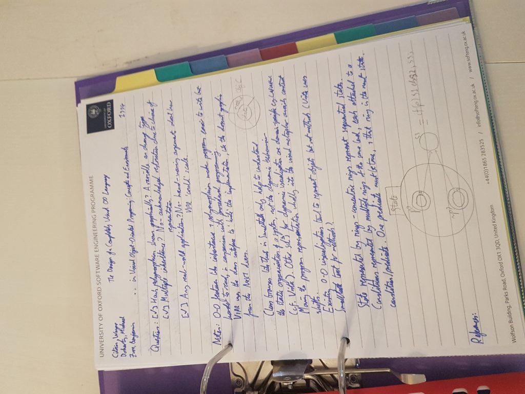
My first prototype was as simple as I could make it. There’s a picture below: it’s a ring binder, with topic dividers, and paper notes (at least one separate sheet for each article) which quickly converged on a pro forma layout as shown.
I liked it, in fact I quickly got to a point where I wouldn’t read an article unless I had access to a pad and pen to add a page to my binder. People I showed it to liked it, too. So this seemed like a good time to crack open the software making tools!
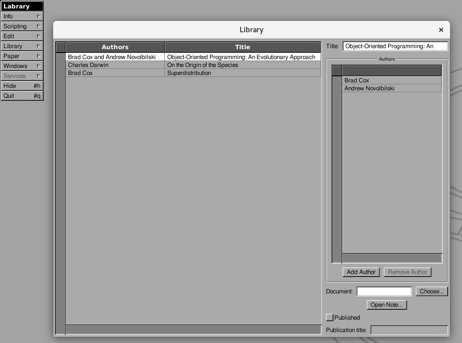
The first software prototype was put together in spare time using GNUstep and Renaissance, and evinced two problems:
- The UI design led back down the route of “bibliopedantry”, forcing students to put more effort into getting the citation details correct than they wanted to.
- Renaissance lacked support for some Cocoa controls it would have been helpful to use, so there was a choice to be made to invest more into improving Renaissance or finding a different UI layout tool.
This experience made me look for other inspiration for ways to organise the user interface so that students get the experience of taking notes, not of fiddling with citation data. I considered writing Labrary as a plugin for the free Calibre e-reader app, so that Labrary could focus on being about study notes and Calibre could focus on being about library management. But ultimately I found the tool that solved the problem best: Apple’s Finder.
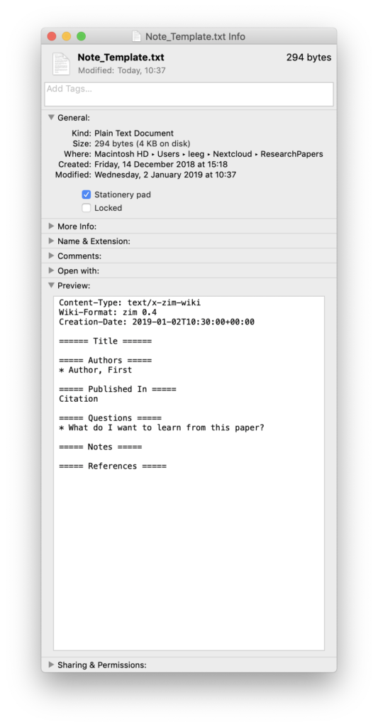
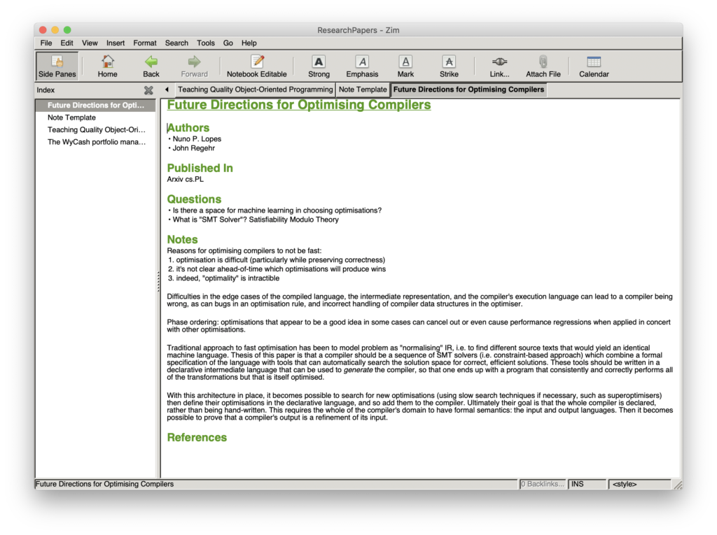
I’ve recreated the pro forma note from the binder as a text file, and set the “Stationery Pad” flag in the Finder. When I open this file, Finder creates a duplicate and opens that instead, in my editor of choice: ready to become a new study note! I put this in a folder with a Zim index file, so I can get the “shoebox” view of all the notes by opening the folder in Zim. It also does full-content searching, so the goal of finding a student’s notes again is achieved.
I’m glad I created the lo-fi paper prototype. It let me understand what I was trying to achieve, and show very quickly that my software implementation was going in the wrong direction. And I’m always happy to be the person to say “do we need to write this, or can it be built out of other bits?”, as I explored for this project with Zim and Calibre.

